
John Clapp
Illustration
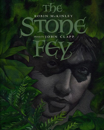
My idea for the Cover for "The Stone Fey"
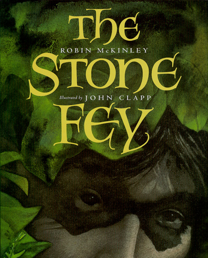
Harcourt's idea for
the Cover for "The Stone Fey"
What really burns me up about this is that in doing the art for the whole book, we had talked about trying to make him quiet, mysterious, and evocative. Then after all that, we end up with BRIGHT YELLOW TYPE on the cover...so much for subtle and mysterious!
I think the one on the left, when placed next to the one on the right, makes the real version look as garish and clumsy as it really is. The whole idea for the cover was supposed to be that he was spying on Maddy...hidden in a bush, barely visible. Yeah, I'm probably being a sensitive primadonna about this, but I still think my version is better. I did learn something though; fight like HELL when you really hate something they're doing to one of your books. It's YOUR name on it, not theirs.