Old &
Alone
Sketch &
Color Comp

Sketch
I really liked this original sketch. When I went to paint it as a comp, I had trouble putting the trees into any kind of working perspective.

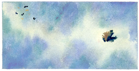
Color CompAs mentioned above, the trees were causing problems at the comp stage. If I put in enough detail to show them as trees, and added the appropriate shadows, the details took away from the old John Farrington in his wheelchair and completely dominated the butterflies.
Finally, with the top comp, I felt I had the feeling I wanted, but the values were far too dark and had too much contrast. I scanned the comp, and used Photoshop to manipulate the image to the value structure I wanted. I rarely use Photoshop for anything other than color correcting for the website, but in this case it saved me a couple hours of effort since everything except the values were the way I wanted them.
Previous Main Painting Next Painting
![]()
Email Order this Book F.A.Q. Reviews Butterfly Links Teachers Kids
johnclapp.com Children's Books